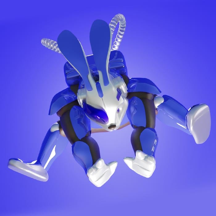
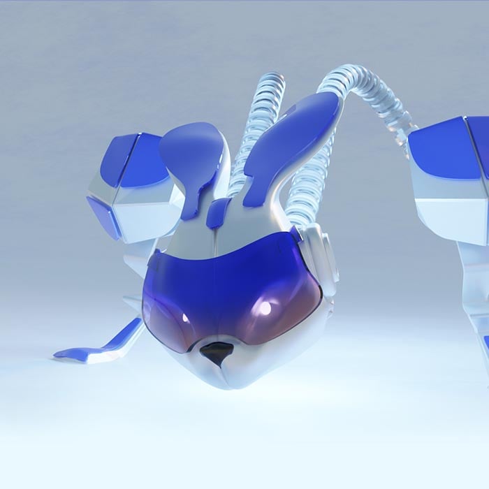
Brand - Dmany
button trigger menu close menu
close menu
twitter icon image telegram conversation dmany
Join the Conversational Channel
twitter icon image telegram news dmany
Join the News Channel to keep updated

Our Brand is
Bright, powerful & intense ..sometimes.
However, neat & tidy brand

ampliador
ampliador

Dmany stands for 'Decentralized many', and is pronounced like 'The many' in a single word.

Our slogan is "We are the many, we are the change" and explains that together we can have a greater impact in the web3 industry and beyond.

About our colors

Looking at the bigger picture, it's clear that blue and yellow are complementary colors that work in harmony with each other.

Although one color may take up more space in a given scenario, it doesn't mean that it's more important than the other.

After all, our powerful blue wouldn't be the same without our beloved little sharp yellow by its side. Metaphorically speaking, predominance and power of decision always remains on the crowd. This principle should be applied to any community, big or small.

Also, sometimes, white color plays a simplifier role in this "intense" combination, providing clearness to the message.

color palette
yellow rabbit the side
logo yellow / blue dmany
ampliador
ampliador

Dmany picked the rabbit as its spirit animal.
Rabbits are a symbol of good luck, and they represent: fertility, love, growth, and a better future.

In the crypto industry the markets go up and down, but the rabbit jumps in harmony with it. Moreover, the rabbit pays tribute to The Matrix, and Alice's Adventures in Wonderland, as it is used as a metaphor for following one's curiosity to the wonderland. If you follow the rabbit, you have the chance to awaken and be free from the system.

We honor the rabbit, as it is ready to go deep down the rabbit hole, which in the crypto world means to fully dedicate ourselves to learn the tokenomics, the mechanics, the technical background, and all details of a project.

We think that as rabbits, we will always thrive as we continue in our quest, looking for value, looking for the carrot.

Rabbits are plentiful in numbers, rabbits are many. And this is where our brand name was born since:
"We are the rabbits, we are the many".

More details

Color Palette

  • #003CFF
    RGB · 0/60/255
  • #0000FF
    RGB · 0/0/255
  • #0000D9
    RGB · 0/0/217
  • #0000B9
    RGB · 0/0/185
  • #000045
    RGB · 0/0/69
  • #FFFF00
    RGB · 255/255/0

Typography

Gilroy has a clean and modern look, making it perfect for contemporary branding and design. Its sleek appearance can help to convey a professional, sophisticated and stylish image.

Gilroy is highly legible, with clear and easy-to-read letters. This makes it ideal for use in digital and print media, ensuring that messages are conveyed clearly and effectively.

Gilroy ExtraBold
Gilroy Medium
Gilroy Light

Margins of security

As a rule of thumb, always leave a margin as thick as the yellow circle in the first black figure. The blue circles (for distinction purposes) have the same size as the yellow.

Do not use like this

There are some cases where is extemely prohibited to use the following compositions.

Do not use the "d" as icon in the logotype
Do not stretch unproportionally or rotate the logotype
Do not put the d in black if the full logotype is in blue
Do not use yellow over white for the logotype
Do not use the "d" as icon in the logotype
Do not stretch unproportionally or rotate the logotype
Do not put the d in black if the full logotype is in blue
Do not use yellow over white for the logotype

Correct usage

sample 2
sample 1
sample 1
sample 2
sample 3
sample 4
sample 5
sample 6
sample 7
sample 8

Find all the dmany brand assets in our multimedia hub

Download all logos, artworks and graphics that you require from our brand hub site.

DOWNLOAD ASSETS

BRANDGUIDE

Download file
graphic brand footer